Clay Buttons
Buttons come in several types and variations. This tutorial covers the different styles and variations of buttons you can create with the Clay taglibs.
Types
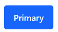
Primary button: Used for the most important actions. Two primary buttons should not be together or near each other.
Primary button with label:
<clay:button label="Primary" />
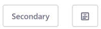
Secondary button: Used for secondary actions. There can be multiple secondary buttons together or near each other.
<div class="col">
    <clay:button displayType="secondary" label="Secondary" />
</div>
<div class="col">
    <clay:button ariaLabel="Wiki" displayType="secondary" icon="wiki" />
</div>
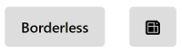
Borderless button: Used in cases such as toolbars where the secondary button would be too heavy for the design. This keeps the design clean.
<div class="col">
    <clay:button displayType="borderless" label="Borderless" />
</div>
<div class="col">
    <clay:button ariaLabel="Page Template" displayType="borderless" icon="page-template" />
</div>
Link button: Used for Cancel actions.
<div class="col">
    <clay:button displayType="link" label="Link" />
</div>
<div class="col">
    <clay:button ariaLabel="Add Role" displayType="link" icon="add-role" />
</div>

You can use labels or icons for your buttons. Below is an example of a Primary button with an icon:
<clay:button ariaLabel="Workflow" icon="workflow" />

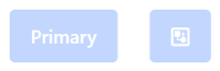
You can disable a button by adding the disabled attribute:
<div class="col">
    <clay:button disabled="<%= true %>" label="Primary" />
</div>
<div class="col">
    <clay:button ariaLabel="Workflow" disabled="<%= true %>" icon="workflow" />
</div>
Variations
Button with icon and text:
<clay:button icon="share" label="Share" />

Button with monospaced text:
<clay:button displayType="secondary" icon="indent-less" monospaced="<%= true %>" />

Block level button:
<clay:button block="<%= true %>" label="Button" />

Plus button:
<clay:button displayType="secondary" icon="plus" monospaced="<%= true %>" />

Action button:
<clay:button displayType="borderless" icon="ellipsis-v" monospaced="<%= true %>" />
