Clay Form Elements
The Liferay Clay tag library provides several tags for creating form elements. An example of each tag is shown below.
Checkbox
Checkboxes give the user a true or false input.
<clay:checkbox
		checked="<%= true %>"
		hideLabel="<%= true %>"
		label="My Input"
		name="name"
/>
Attributes:
checked: Whether the checkbox is checked
disabled: Whether the checkbox is enabled
hideLabel: Whether to display the checkbox label
indeterminate: Checkbox variable for multiple selection
label: The checkbox’s label
name: The checkbox’s name

Radio
A radio button lets the user select one choice from a set of options in a form.
<clay:radio
		checked="<%= true %>"
		hideLabel="<%= true %>"
		label="My Input"
		name="name"
/>
Attributes:
checked: Whether the radio button is checked
hideLabel: Whether to display the radio button label
disabled: Whether the radio button is enabled
label: The radio button’s label
name: The radio button’s name

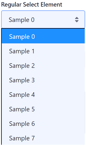
Selector
A selector gives the user a select box with a set of options to choose from.
The Java scriplet below creates eight dummy options for the selector:
<%
List<Map<String, Object>> options = new ArrayList<>();

for (int i = 0; i < 8; i++) {
	Map<String, Object> option = new HashMap<>();

	option.put("label", "Sample " + i);
	option.put("value", i);

	options.add(option);
}
%>
<clay:select
		label="Regular Select Element"
		name="name"
		options="<%= options %>"
/>
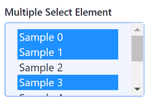
If you want let users select multiple options at once, set the multiple attribute to true:
<clay:select
		label="Multiple Select Element"
		multiple="<%= true %>"
		name="name"
		options="<%= options %>"
/>
Attributes:
disabled: Whether the selector is enabled label: The selector’s label multiple: Whether multiple options can be selected name: The selector’s name
Now you know how to use Clay taglibs to add common form elements to your app!