Adding Configuration Options to Fragments
Liferay DXP 7.2 SP1
Configurable options make your fragments flexible, reducing the need to maintain many similar fragments. For example, instead of creating separate fragments for a heading with style A and another for style B, you can create a fragment with configurable heading styles. Learn how to add configuration options to a fragment:
- Deploy a Configurable Fragment
- Examine the Configuration
- Modify the Configuration
- Propagate the Changes and Test
- Related Information
For Liferay DXP 7.4+, fragment collections are called fragment sets in the Liferay UI.
Deploy a Configurable Fragment
Start a new Liferay instance by running
docker run -it -m 8g -p 8080:8080 liferay/portal:7.4.3.112-ga112
Sign in to Liferay at http://localhost:8080. Use the email address test@liferay.com and the password test. When prompted, change the password to learn.
Then, follow these steps to deploy an example to see how fragment configuration options work:
-
Download and unzip the example fragment set:
curl https://resources.learn.liferay.com/dxp/latest/en/site-building/developer-guide/developing-page-fragments/liferay-c7f8.zip -Ounzip liferay-c7f8.zip
-
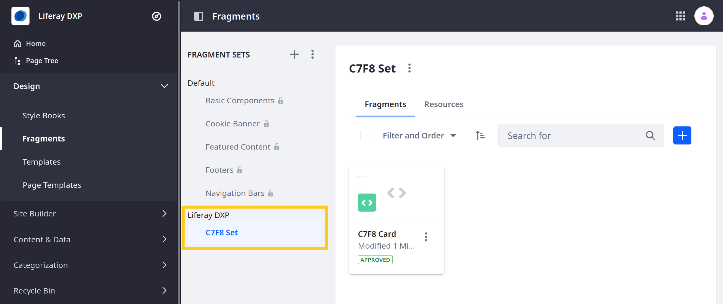
Verify the fragment set is available. Open the Site Menu (
 ) and go to Design → Fragments. The set should appear in the list.
 Note
NoteFor Liferay DXP 7.1 and 7.2, navigate to Site → Site Builder → Page Fragments under the Product Menu to get to the fragments page.
-
Go to a content page and click Edit (
 ) to begin editing.
 -
Expand the C7F8 Set heading in the Fragments and Widgets panel and drag the C7F8 Card fragment onto the page.
-
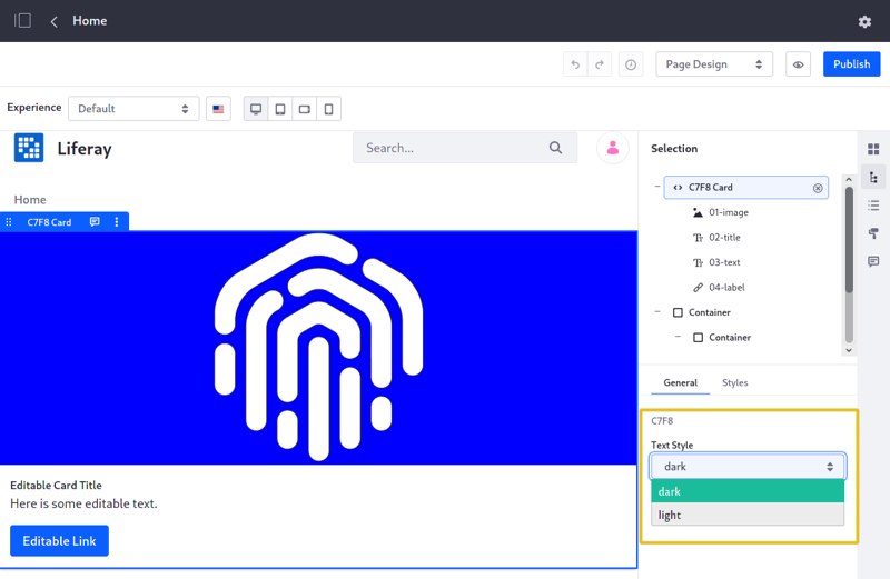
Select the C7F8 Card on the page to open the Fragment Configuration Menu. In the General tab, set the component’s text style to dark or light.

Great! You successfully imported and configured a configurable Fragment.
Examine the Configuration
You can edit a fragment’s configuration options in Liferay’s built-in Fragments Editor or in a text file.
Using the Fragments Editor: In the UI, edit the fragment with the Fragments Editor and select the Configuration tab. The fragment’s configuration appears in the editor.
Editing a Fragment Configuration File: If you don’t have the fragment files, export them from the fragment by opening the fragment’s actions menu and clicking Export. The configurationPath field (optional) in a fragment’s fragment.json file specifies the configuration .json file. If it doesn’t have a configuration file, create one and set the configurationPath field to the configuration file name.
Open the example’s fragment.json file to determine the fragment’s configuration file.
{
   "configurationPath": "index.json",
   "cssPath": "index.css",
   "htmlPath": "index.html",
   "jsPath": "index.js",
   "name": "C7F8 Card",
   "type": "component"
}
The "configurationPath": "index.json" property indicates this fragment’s configuration file is index.json.
Open the configuration file.
{
   "fieldSets": [
      {
         "fields": [
               {
                  "dataType": "string",
                  "defaultValue": "dark",
                  "label": "Text Style",
                  "name": "c7f8TextStyle",
                  "type": "select",
                  "typeOptions": {
                     "validValues": [
                           {
                              "value": "dark"
                           },
                           {
                              "value": "light"
                           }
                     ]
                  }
               }
         ],
         "label": "C7F8"
      }
   ]
}
The configuration file above, specifies a selector for applying a dark or light text style to the fragment. The configuration has a field named c7f8TextStyle. The field’s type is select, which makes it a selector component. See Fragment Configuration Types for details.
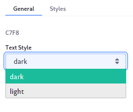
The selector’s valid values are dark or light. The "dataType": "string" property means that the selector operates on string data. This selector is a part of a field set labeled C7F8 (the label is optional).
In the UI, this selector is found in the fragment’s configuration section labeled C7F8. The selector is labeled Text Style per the field’s label property. The figure below shows the selector.

The Fragments Editor doesn’t save the configuration until it’s valid. Make sure your JSON configuration is valid before previewing it.
The configuration values selected by the user are made available to the HTML through the FreeMarker context. They are referenced in the HTML with the notation ${configuration.fieldName}. The example (${configuration.textAppliedStyle}) returns dark or light depending on the configuration value selected by the user, setting the CSS class to text-light or text-dark:
<div class="component-c7f8-card">
   <div class="card">
      <img
         class="card-img-top"
         data-lfr-editable-id="01-image"
         data-lfr-editable-type="image"
         src="https://clayui.com/images/home/lexicon_symbol.svg"
      />

      <div class="card-body">
         <h5
               class="card-title text-${configuration.c7f8TextStyle}"
               data-lfr-editable-id="02-title"
               data-lfr-editable-type="rich-text"
         >
               Editable Card Title
         </h5>

         <p
               class="card-text text-${configuration.c7f8TextStyle}"
               data-lfr-editable-id="03-text"
               data-lfr-editable-type="rich-text"
         >
               Here is some editable text.
         </p>

         <a
               class="btn btn-primary"
               data-lfr-editable-id="04-label"
               data-lfr-editable-type="link"
               href="#"
         >
               Editable Link
         </a>
      </div>
   </div>
</div>
The example demonstrates a select configuration. See the Configuration Types Reference for a complete list of the available fragment configuration types.
Modify the Configuration
-
Open the Site Menu (
 ) and go to Design → Fragments.Note
For Liferay DXP 7.1 and 7.2, instead navigate to Site → Site Builder → Page Fragments under the Product Menu to get to the fragments page.
-
Select the C7F8 Set, click Actions (
 ) for the C7F8 Card and select Edit. This opens the Fragments Editor.
 -
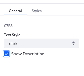
Select the Configuration tab and update the configuration with a checkbox field to hide/show the card’s description. Insert this code on a new line after the
c7f8TextStylefield’s closing brace and comma (},){ "name": "showDescription", "label": "Show Description", "description": "show-description", "type": "checkbox", "defaultValue": true }TipYou can add a
configurationRolevalue to the field set (alongside thefieldsobject in the JSON) to specify which tab the associated fields appear in. Set the value asstylesto make the fields appear in the Styles tab, or set it toadvancedto make them appear in the Advanced tab (only in Liferay DXP versions U23+ or GA23+). If noconfigurationRoleis set, then they appear in the General tab by default. -
Go back to the HTML pane in the Code tab and wrap the paragraph element with a conditional statement to check for the checkbox’s value. Click Publish to apply the changes.
[#if configuration.showDescription]
<p data-lfr-editable-id="03-card-text" data-lfr-editable-type="rich-text"
class="card-text text-${configuration.textAppliedStyle}">
   Here is some editable text.
</p>
[/#if]
You can also access the configuration’s value through the JavaScript with the syntax const configurationValue = configuration.textAppliedStyle;.
Propagate the Changes and Test
Now you can test the updates.
-
Propagate the changes so they’re reflected on the Content Page. Click Actions (
 ) for the C7F8 Card and select View Usages.
 -
Check the box for the Content Page and click the (
 ) button.
-
Go back to the Content Page and once again click the (
 ) icon to edit the Content Page.
 -
Select the C7F8 Card again to show the Selection panel on the right.
-
In the General tab, check/uncheck the Show Description checkbox to show/hide the card’s text.

Great! Now you know how to add configuration options to your fragments. For more configuration examples, please see Please see Fragment Configuration Types.