Clay Badges
Badges help highlight important information such as notifications or new and unread messages. Badges have circular borders and are only used to specify a number. This covers the different types of Clay badges you can add to your app.
Badge Types
The following badge styles are available:
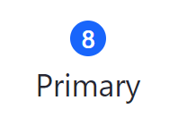
Primary badge:
<div class="col-md-1">
    <clay:badge label="8" />

    <div>Primary</div>
</div>
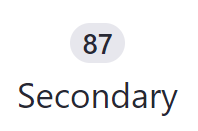
Secondary badge:
<div class="col-md-1">
    <clay:badge displayType="secondary" label="87" />

    <div>Secondary</div>
</div>
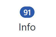
Info badge:
<div class="col-md-1">
    <clay:badge displayType="info" label="91" />

    <div>Info</div>
</div>
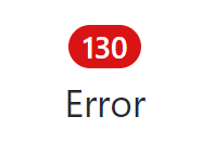
Error badge:
<div class="col-md-1">
    <clay:badge displayType="danger" label="130" />

    <div>Error</div>
</div>
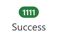
Success badge:
<div class="col-md-1">
    <clay:badge displayType="success" label="1111" />

    <div>Success</div>
</div>
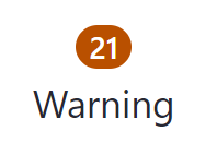
Warning badge:
<div class="col-md-1">
    <clay:badge displayType="warning" label="21" />

    <div>Warning</div>
</div>
Now you know how to use badges to keep track of values in your app.