Clay Cards
Cards visually represent data. Use them for images, document libraries, user profiles and more. There are four main types of Cards:
- Image Cards
- File Cards
- User Cards
- Horizontal Cards
Each of these types is covered below.
Image Cards
Image Cards are used for image/document galleries.
Image Card:

Image Card with icon:
Image Card empty:
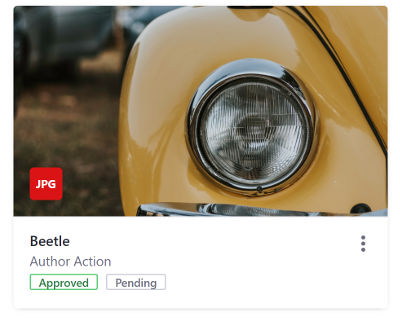
Cards can also contain file types. Specify the file type with the filetype attribute:

Include the labels attribute to add a label to a Card:
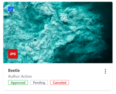
Include the selectable attribute to make cards selectable (include a checkbox):
File Cards
File Cards display an icon of the file’s type. They represent file types other than image files (i.e. PDF, MP3, DOC, etc.).
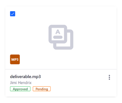
You can optionally use the labelStylesMap attribute to pass a HashMap of multiple labels, as shown above.
The example below specifies a list icon instead of the default file icon:
The full list of available Liferay icons can be found on the Clay CSS website.
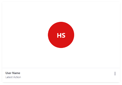
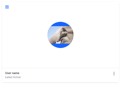
User Cards
User Cards display user profile images or the initials of the user’s name or name+surname.
User Card with initials:
User Card with profile image:
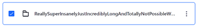
Horizontal Cards
Horizontal Cards represent folders and can have the same amount of information as other Cards. The key difference is that horizontal Cards let you remove the image portion of the Card, since only the folder icon is required.
Now you know how to use Cards in your UI to display information in your apps.