Clay Dropdown Menus and Action Menus
You can add dropdown menus to your app via the clay:dropdown-menu and clay:actions-menu taglibs. The Clay taglibs provide several menu variations for you to choose. Both taglibs with several examples are shown below.
Dropdown Menus
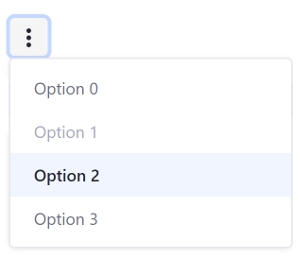
Basic dropdown menu:
<clay:dropdown-menu
	items="<%= dropdownsDisplayContext.getDefaultDropdownItems() %>"
	label="Default"
/>
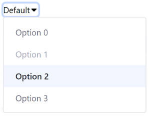
The dropdown menu’s items are defined in its Java class–dropdownDisplayContext in this case. Menu items are NavigationItem objects. You can disable menu items with the setDisabled(true) method and make a menu item active with the setActive(true) method. The href attribute is set with the setHref() method, and labels are defined with the setLabel() method. Here’s an example implementation of the dropdownDisplayContext class:
if (_defaultDropdownItems != null) {
  return _defaultDropdownItems;
}

_defaultDropdownItems = new ArrayList<>();

for (int i = 0; i < 4; i++) {
  NavigationItem navigationItem = new NavigationItem();

  if (i == 1) {
    navigationItem.setDisabled(true);
  }
  else if (i == 2) {
    navigationItem.setActive(true);
  }

  navigationItem.setHref("#" + i);
  navigationItem.setLabel("Option " + i);

  _defaultDropdownItems.add(navigationItem);
}

return _defaultDropdownItems;
}
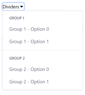
You can organize menu items into groups by setting the NavigationItem’s type to TYPE_GROUP and nesting the items in separate ArrayLists. You can add a horizontal separator to separate the groups visually with the setSeparator(true) method. Below is a code snippet from the dropdownsDisplayContext class:
group1NavigationItem.setSeparator(true);
group1NavigationItem.setType(NavigationItem.TYPE_GROUP);
Corresponding taglib:
<clay:dropdown-menu
	items="<%= dropdownsDisplayContext.getGroupDropdownItems() %>"
	label="Dividers"
/>
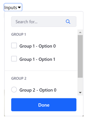
You can also add inputs to dropdown menus. To add an input to a dropdown menu, set the input’s type with the setType() method (e.g. NavigationItem.TYPE_CHECKBOX), its name with the setInputName() method, and its value with the setInputValue() method. Here’s an example implementation:
navigationItem.setInputName("checkbox" + i);
navigationItem.setInputValue("checkboxValue" + i);
navigationItem.setLabel("Group 1 - Option " + i);
navigationItem.setType(NavigationItem.TYPE_CHECKBOX);
Corresponding taglib:
<clay:dropdown-menu
	buttonLabel="Done"
	items="<%= dropdownsDisplayContext.getInputDropdownItems() %>"
	label="Inputs"
	searchable="<%= true %>"
/>
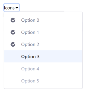
Menu items can also contain icons. To add an icon to a menu item, use the setIcon() method. Below is an example:
navigationItem.setIcon("check-circle-full")
Corresponding taglib:
<clay:dropdown-menu
	items="<%= dropdownsDisplayContext.getIconDropdownItems() %>"
	itemsIconAlignment="left"
	label="Icons"
/>
Actions Menus
Basic actions menu:
<clay:dropdown-actions
	items="<%= dropdownsDisplayContext.getDefaultDropdownItems() %>"
/>
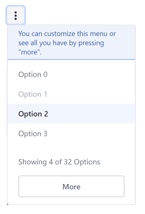
An actions menu can also display help text to the user:
<clay:dropdown-actions
	buttonLabel="More"
	buttonStyle="secondary"
	caption="Showing 4 of 32 Options"
	helpText="You can customize this menu or see all you have by pressing \"more\"."
	items="<%= dropdownsDisplayContext.getDefaultDropdownItems() %>"
/>
Clay taglibs make it easy to add dropdown menus and action menus to your apps.