Writing a Custom Form Field Type
The Forms application contains many highly configurable field types out-of-the-box. Most use cases are met with one of the existing field types. If your use case can’t be met with the default field types, you can create your own.
- Deploy an example project and see how it works
- Understand the form field’s code
- Add custom settings to the field
Forms created with Documents and Media (Metadata Sets), Web Content (Structures), and the Forms application can all consume the same form fields. By default a custom form field is only used in the Forms application. To specify explicitly which applications should enable the form field type, add the component property:
"ddm.form.field.type.scope=document-library,forms,journal"
The example project runs on Liferay 7.4. If you’re running Liferay 7.3, the source code is compatible but the Workspace project must be reconfigured for Liferay 7.3. The steps to do this are included in the instructions below.
If you’re running Liferay 7.2, this source code does not run due to a difference in supported frontend frameworks. See Developing a Custom Form Field for Liferay 7.2 to learn how to adapt the C2P9 Slider code sample for 7.2.
Examine the Custom Form Field in Liferay
To see how custom form fields work, deploy an example and then add some form data using the new field.
Deploy the Example
Start a new Liferay instance by running
docker run -it -m 8g -p 8080:8080 liferay/portal:7.4.3.132-ga132
Sign in to Liferay at http://localhost:8080. Use the email address test@liferay.com and the password test. When prompted, change the password to learn.
Then, follow these steps:
-
Download and unzip the Custom Form Field Type project.
curl https://resources.learn.liferay.com/examples/liferay-c2p9.zip -Ounzip liferay-c2p9.zip -
From the module root, build and deploy.
./gradlew deploy -Ddeploy.docker.container.id=$(docker ps -lq)TipThis command is the same as copying the deployed jars to /opt/liferay/osgi/modules on the Docker container.
NoteFor Liferay 7.3, make these adjustments to the project before deploying it:
-
In
c2p9-impl/package.json, change thedevDependenciesreference from@liferay/portal-7.4to@liferay/portal-7.3. -
In
gradle.properties, change theliferay.workspace.productvalue toportal-7.3-ga8(if a Liferay 7.3 version newer than GA8 is available, try to reference it here instead).
-
-
Confirm the deployment in the Liferay Docker container console.
STARTED com.acme.c2p9.impl_1.0.0 [1009]
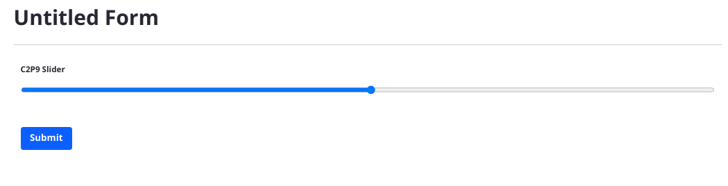
Use the Deployed Slider Field
-
Open your browser to http://localhost:8080.
-
Go to the Forms application in Site Menu → Content & Data → Forms.
-
Click the Add button (
 ) to open the Form Builder.
 -
Add the C2P9 Slider field to the form.
-
You can fill out the Label, Predefined Value, and Help Text, as well as make the field Required. These settings match what many out-of-the-box fields provide as basic settings.
-
Publish the form and go submit a record using the slider field.
Understand the Form Field’s Code
A basic form field contains a Java class and a JavaScript file. In the C2P9 Slider field, C2P9DDMFormFieldType.java provides a DDMFormFieldType implementation by extending the abstract class BaseDDMFormFieldType and defining its metadata in the OSGi Component:
@Component(
	property = {
		"ddm.form.field.type.description=c2p9-description",
		"ddm.form.field.type.display.order:Integer=10",
		"ddm.form.field.type.group=customized", "ddm.form.field.type.icon=text",
		"ddm.form.field.type.label=c2p9-label",
		"ddm.form.field.type.name=c2p9-slider"
	},
	service = DDMFormFieldType.class
)
public class C2P9DDMFormFieldType extends BaseDDMFormFieldType {
ddm.form.field.type.description: provide the language key for the description text. Make sure the translated value is defined in the Language.properties file.
ddm.form.field.type.display.order: set an integer or floating point value to determine where the field appears in the Form Builder sidebar. Fields with the same value are ordered randomly.
ddm.form.field.type.icon: decide which icon type to use for your field. Choose any Clay Icon.
ddm.form.field.type.label: provide the language key for the label text. Make sure the translated value is defined in the Language.properties file.
ddm.form.field.type.name: provide the field type identifier. This is used to identify the field internally and in other components.
The getModuleName method passes the Slider.es.js file path to the NPMResolver service.
@Override
public String getModuleName() {
	return _npmResolver.resolveModuleName(
		"dynamic-data-mapping-form-field-type-c2p9-slider/C2P9/Slider.es");
}
@Reference
private NPMResolver _npmResolver;
Some of the path definition is accomplished in the package.json file (see the name declaration and the source-maps defined in the scripts section).
The getName method returns the form field identifier. It must match the value in the component property ddm.form.field.type.name.
@Override
public String getName() {
	return "c2p9-slider";
}
The isCustomDDMFormFieldType is used internally. Return true if you’re returning the result of NPMResolver.resolveModuleName() in the getModuleName method.
@Override
public boolean isCustomDDMFormFieldType() {
	return true;
}
Slider.es.js provides the JavaScript logic for the field. One component is defined in the file; Slider.
The import statements bring in functionality from Liferay’s base form field, dynamic-data-mapping-form-field-type. This allows wrapping the input in the FieldBase component to give the custom slider style and structure consistent with Liferay’s fields.
import {ReactFieldBase as FieldBase} from 'dynamic-data-mapping-form-field-type';
import React, {useState} from 'react';
The export default function Slider ({... block defines the field: it’s instantiated with the parameters label name, onChange, predefinedValue, readOnly, and value.
export default function Slider({
	label,
	name,
	onChange,
	predefinedValue,
	readOnly,
	value,
	...otherProps
	}) {
	const [currentValue, setCurrentValue] = useState(
		value ? value : predefinedValue
	);
The values for these parameters, along with some others, define the HTML <input> tag for the form field. Importantly, the max and min values that the user can select are hard coded right now. You’ll change this later. The field’s value is defined using a ternary operator: if a value is entered, use it. Otherwise use the predefined value.
When the user drags the slider, the onInput event listener fires, setting the current value of the slider and calling the onChange function to alert the parent component of the change.
onInput={(event) => {
	setCurrentValue(event.target.value);
	onChange(event);
}}
Add Custom Settings to the Form Field
Right now the Max and Min settings for the Slider field are hard coded, but it’s better if they’re configurable. To add custom settings to a form field,
- Adjust the backend by adding a
DDMFormFieldTypeSettingsclass and adding a method to theDDMFormFieldType. - Adapt the frontend for rendering the new settings by adding a
DDMFormFieldTemplateContextContributorand updating the way the settings are defined inSlider.es.js.
Supporting Custom Settings in the Backend
The form field’s settings are defined in the DDMTypeSettings class, which also defines the form that appears in the field’s sidebar using the @DDMForm annotation. Then the DDMFormFieldType itself must know about the new settings definition so it doesn’t display the default field settings form. A DDMFormFieldContextContributor class sends the new settings to the React component to show it to the end user.
-
Add a
C2P9DDMFormFieldTypeSettingsJava class to thecom.acme.c2p9.internal.dynamic.data.mapping.form.field.typepackage.package com.acme.c2p9.internal.dynamic.data.mapping.form.field.type; import com.liferay.dynamic.data.mapping.annotations.DDMForm; import com.liferay.dynamic.data.mapping.annotations.DDMFormField; import com.liferay.dynamic.data.mapping.annotations.DDMFormLayout; import com.liferay.dynamic.data.mapping.annotations.DDMFormLayoutColumn; import com.liferay.dynamic.data.mapping.annotations.DDMFormLayoutPage; import com.liferay.dynamic.data.mapping.annotations.DDMFormLayoutRow; import com.liferay.dynamic.data.mapping.form.field.type.DefaultDDMFormFieldTypeSettings; @DDMForm @DDMFormLayout( paginationMode = com.liferay.dynamic.data.mapping.model.DDMFormLayout.TABBED_MODE, value = { @DDMFormLayoutPage( title = "%basic", value = { @DDMFormLayoutRow( { @DDMFormLayoutColumn( size = 12, value = { "label", "predefinedValue", "required", "tip" } ) } ) } ), @DDMFormLayoutPage( title = "%advanced", value = { @DDMFormLayoutRow( { @DDMFormLayoutColumn( size = 12, value = { "dataType", "min", "max", "name", "showLabel", "repeatable", "type", "validation", "visibilityExpression" } ) } ) } ) } ) public interface C2P9DDMFormFieldTypeSettings extends DefaultDDMFormFieldTypeSettings { @DDMFormField( label = "%max-value", properties = "placeholder=%enter-the-top-limit-of-the-range", type = "numeric" ) public String max(); @DDMFormField( label = "%min-value", properties = "placeholder=%enter-the-bottom-limit-of-the-range", type = "numeric" ) public String min(); } -
There are two language keys for each setting: the
labeland theplaceholder. Openc2p9-impl/src/main/resources/content/Language.propertiesand add these lines:max-value=Maximum Value min-value=Minimum Value enter-the-bottom-limit-of-the-range=Enter the bottom limit of the range. enter-the-top-limit-of-the-range=Enter the top limit of the range. -
Update the
DDMFormFieldTypeclass by adding/overriding thegetDDMFormFieldTypeSettingsmethod:@Override public Class<? extends DDMFormFieldTypeSettings> getDDMFormFieldTypeSettings() { return C2P9DDMFormFieldTypeSettings.class; }
Supporting Custom Settings in the Frontend
The frontend requires updates to the Slider.es.js to support user-entered min and max values and a DDMTemplateContextContributor so that the frontend can receive the setting values from the backend.
-
Create a
C2P9DDMFormFieldTemplateContextContributorclass in thecom.acme.c2p9.internal.dynamic.data.mapping.form.field.typepackage:package com.acme.c2p9.internal.dynamic.data.mapping.form.field.type; import com.liferay.dynamic.data.mapping.form.field.type.DDMFormFieldTemplateContextContributor; import com.liferay.dynamic.data.mapping.model.DDMFormField; import com.liferay.dynamic.data.mapping.render.DDMFormFieldRenderingContext; import java.util.HashMap; import java.util.Map; import org.osgi.service.component.annotations.Component; @Component( property = "ddm.form.field.type.name=c2p9-slider", service = DDMFormFieldTemplateContextContributor.class ) public class C2P9DDMFormFieldTemplateContextContributor implements DDMFormFieldTemplateContextContributor { @Override public Map<String, Object> getParameters( DDMFormField ddmFormField, DDMFormFieldRenderingContext ddmFormFieldRenderingContext) { Map<String, Object> parameters = new HashMap<>(); parameters.put("max", (String)ddmFormField.getProperty("max")); parameters.put("min", (String)ddmFormField.getProperty("min")); return parameters; } } -
Update the JavaScript component in
Slider.es.js, removing the hard coded min and max values and instead allowing for the user to enter their values. The full file contents appear below:import {ReactFieldBase as FieldBase} from 'dynamic-data-mapping-form-field-type'; import React, {useState} from 'react'; export default function Slider({ label, max, min, name, onChange, predefinedValue, readOnly, value, ...otherProps }) { const [currentValue, setCurrentValue] = useState( value ? value : predefinedValue ); return ( <FieldBase label={label} name={name} predefinedValue={predefinedValue} {...otherProps} > <input className="ddm-field-slider form-control slider" disabled={readOnly} id="myRange" max={max} min={min} name={name} onInput={(event) => { setCurrentValue(event.target.value); onChange(event); }} type="range" value={currentValue ? currentValue : predefinedValue} /> </FieldBase> ); }; -
Redeploy the form field module. Once it’s processed (STOPPED → STARTED in the console), restart Liferay:
./gradlew deploy -Ddeploy.docker.container.id=$(docker ps -lq)docker container restart $(docker ps -lq) -
Test the Slider field in a form again. This time make sure you go to the Advanced tab in the field’s sidebar settings and try a different min and max setting.

Adapting the C2P9 Slider for Liferay DXP 2025.Q2
The C2P9 Slider sample targets Liferay DXP 2025.Q1/Portal GA132. Due to the deprecation of the AMD Loader, some changes must be made for Liferay DXP 2025.Q2. After adding the form settings, make these changes:
-
Replace the
c2p9-impl/package.jsonfile with these contents:{ "dependencies": { "react": "^18.2.0", "react-dom": "^18.2.0" }, "devDependencies": { "esbuild": "^0.20.2" }, "main": "./", "name": "dynamic-data-mapping-form-field-type-c2p9-slider", "scripts": { "build": "esbuild ./src/main/resources/META-INF/resources/C2P9/Slider.es.js --outfile=./build/resources/main/META-INF/resources/__liferay__/index.js --bundle --format=esm --external:react --external:react-dom --external:@liferay/dynamic-data-mapping-form-field-type --loader:.js=jsx" }, "version": "1.0.0" } -
Replace the
c2p9-impl/src/main/resources/META-INF/resources/C2P9/Slider.es.jsfile with these contents:import React, {useState} from "react"; import {ReactFieldBase} from "@liferay/dynamic-data-mapping-form-field-type"; export function Slider({ label, name, onChange, predefinedValue, readOnly, value, ...otherProps }) { const [currentValue, setCurrentValue] = useState( value ? value : predefinedValue ); return ( <ReactFieldBase label={label} name={name} predefinedValue={predefinedValue} {...otherProps} > <input className="ddm-field-slider form-control slider" disabled={readOnly} id="myRange" max={100} min={1} name={name} onInput={(event) => { setCurrentValue(event.target.value); onChange(event); }} type="range" value={currentValue ? currentValue : predefinedValue} /> </ReactFieldBase> ); }; -
Open the
C2P9DDMFormFieldTypeclass and replace the methodgetModuleNamewith this method:@Override public String getESModule() { return "{Slider} from dynamic-data-mapping-form-field-type-c2p9-slider"; }