Webコンテンツ
基本Webコンテンツ記事の追加 は、サイト訪問者に情報を提供するための重要な資産である。 Analytics Cloudでは、サイト ユーザーがどのようにコンテンツを利用しているかについて、重要な洞察を得ることができます。
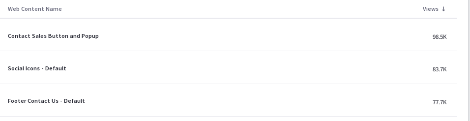
あなたのサイトのウェブコンテンツ記事のリストが、さまざまな指標とともに表示されます。 このデータをCSVファイルとしてダウンロードするには、 Download Report をクリックする。 詳しくは ダウンロードレポート をご覧ください。
訪問者の行動
資産の詳細の概要タブには、いくつかのデータが表示されます。 このダッシュボード・ビューをPDFファイルとしてダウンロードするには、 Download Report をクリックしてください。 詳しくは ダウンロードレポート をご覧ください。
最初のチャートは、訪問者の行動と呼ばれ、1つの重要な指標を含んでいます:総ビュー。
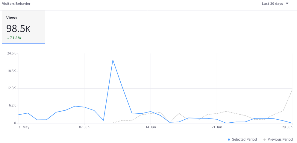
1日あたりの視聴回数(昨日または過去24時間を選択した場合は1時間あたりの視聴回数)を、選択した期間にわたってプロットし、視聴傾向線を作成する。 これを使用して、時間の経過とともにコンテンツが訪問者をどれだけうまく巻き込んでいるかを評価します。
オーディエンス
オーディエンスレポートでは、チャートを使用して、アセットとオーディエンスの相互作用に関する情報を提示しています。 これらの質問に答えてくれます。
- どのくらいのユーザーが私のコンテンツにエンゲージしているのか?
- これらのユーザーのうち、何人が既知の訪問者なのか、それとも匿名なのか?
- 私のコンテンツに接触したユーザーのうち、何人がAnalytics Cloudのセグメントに属していますか?
- セグメントに属するユーザーのうち、上位15セグメントは?
以下は聴衆レポートのグラフである:
ビュー数: 既知または匿名のユニークビジター総数のパーセンテージを示すドーナツチャート。 中央には、ユニークな訪問者の総数が表示されています。 ツールチップには、そのセクションのユーザー数(例えば、既知または匿名のユーザー数)が表示されます。
個人は、ログイン時にメールアドレスがAnalytics Cloudと同期されたユーザー データと一致した時点で既知と見なされます。 新規ユーザーがサイトに登録すると、そのデータが Analytics Cloud と同期され、既知の個人として表示されるまでに最大 2 時間かかる場合があります。
Segmented Views: 既知の個人のうち、1 つまたは複数の Analytics Cloud セグメントに属するか属さないかの割合を示すドーナツ チャート。 中央には、既知の個体数の合計が表示されています。 なお、このグラフの算出には、既知の個体のみが使用されている。
視聴者セグメント: 各セグメントを構成する既知の個人の割合を示す棒グラフ。 このチャートは、上位5つのセグメントごとにバーを表示し、残りのセグメントを最後のバーに集約している。 最後のバーのツールチップには、残りの各セグメントの値が表示される。
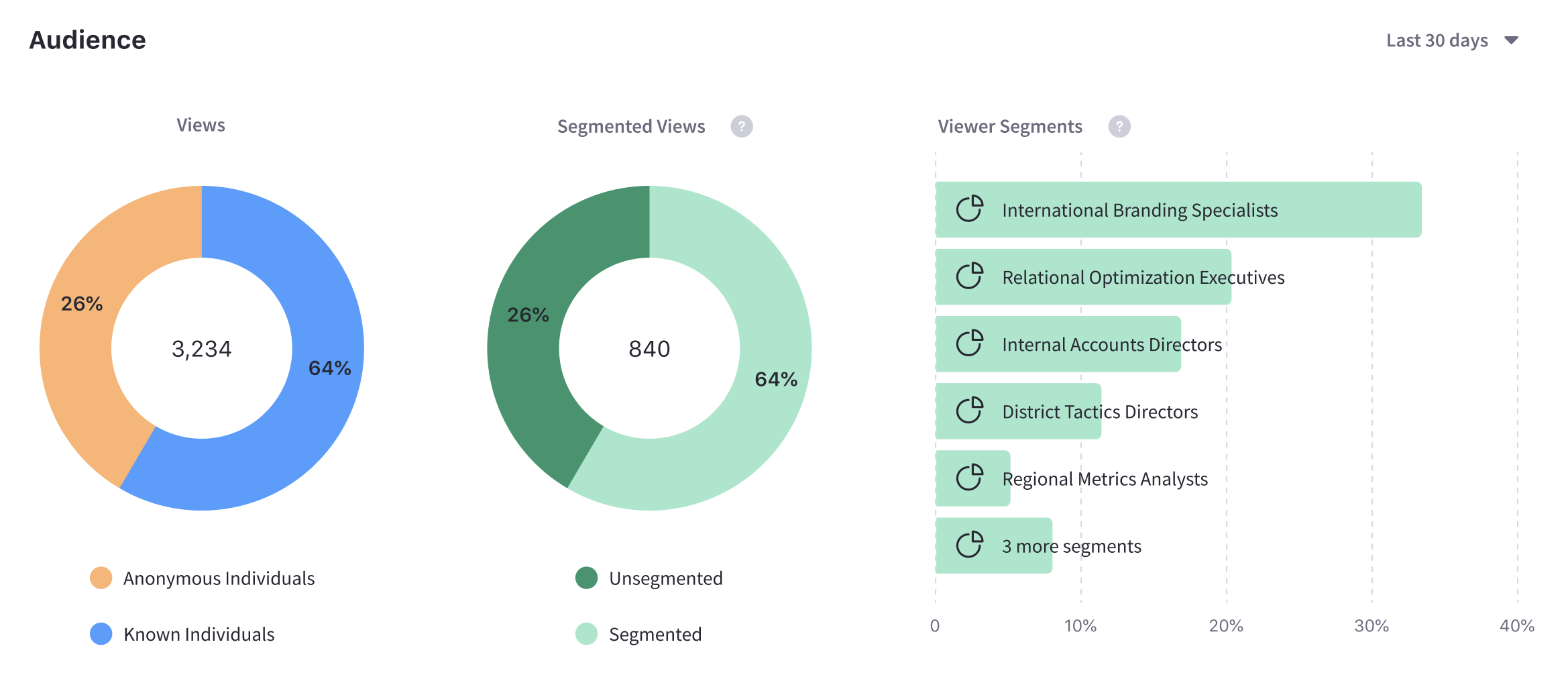
なお、オーディエンスについて表示されるセグメンテーションデータは、訪問時にセグメントに所属している個人を基準としています。
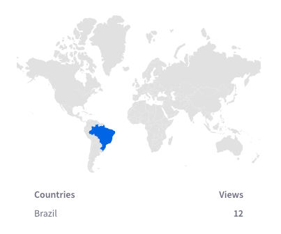
場所別の表示数
[Views by Location ] パネルのマップには、選択した期間の国別のビュー数が表示されます。
テクノロジー別の表示数
デフォルトの[デバイス]タブで、オペレーティングシステム別(デバイスタイプ別にグループ化)のページビューの積み上げ棒グラフを表示します。
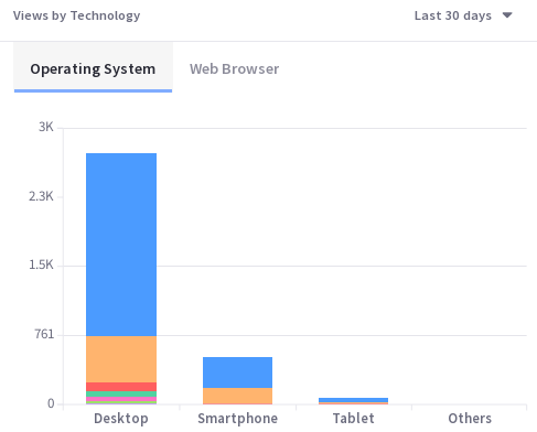
ブラウザー_をクリックすると、選択した期間の上位8つのウェブブラウザーを表示するドーナツチャートが表示されます。 該当する場合、残りのWebブラウザは9番目のドーナツセグメントに集約されます。
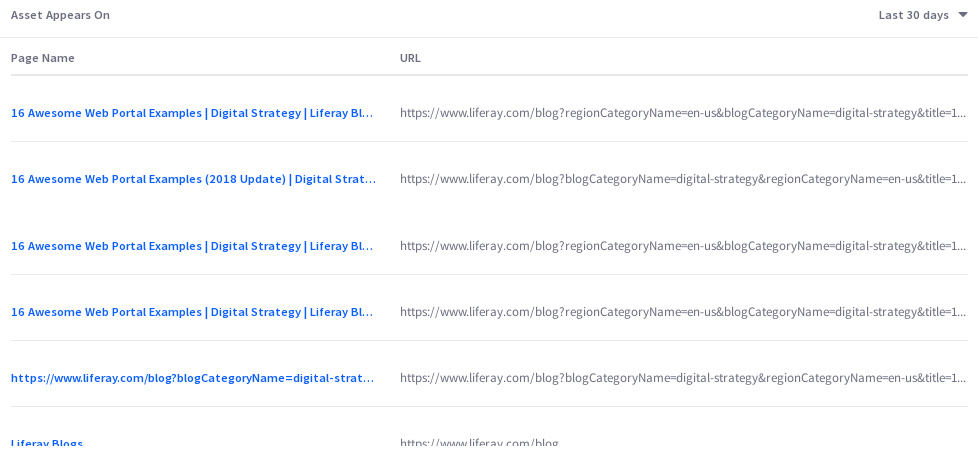
アセットの出現箇所
アセットが表示される表には、ページ名とURLが含まれています。 Analytics Cloud の他のページ データと同様に、サイト訪問者が何らかの方法で相互作用したページのみが追跡され、レポートされます。 注意すべき点は、このリンクはアセットが掲載されている実際のページには飛ばないということだ。 代わりに、ページのページ分析ビューにつながる。 そこから実際のページのURLをクリックできる。