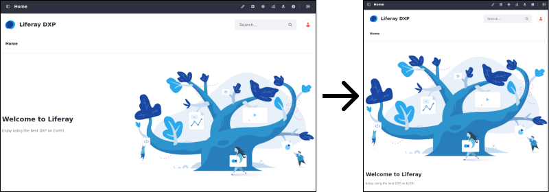
Building a Responsive Site
More than half of all page views in the world come from mobile devices like phones and tablets. Any site should look as good when viewed by a mobile device as it does on a desktop. Liferay DXP can help you provide the best experience possible no matter what device visits your site.
Out-of-the-box, Liferay uses responsive layouts:
-
DXP widgets and custom widgets using Liferay’s UI frameworks automatically scale to fit the screen size.

-
UI elements like the Navigation and Product Menu automatically adjust to remain usable on smaller screens.

-
When the screen width is low, Liferay combines columns so that all content remains legible.

-
For web developers, theme tools help ensure optimum mobile performance.
If you’re using the default theme, your pages already adjust to fit mobile devices. There are also tools to verify that everything appears as intended. The device simulator (![]() ) shows you how pages look on different devices.
) shows you how pages look on different devices.
In Liferay 7.2 you can create mobile device rules that govern site behavior on detection of a mobile device. For more information on creating mobile device rules, see Creating Mobile Device Rules.