Predictive Charts
Predictive charts let you visualize current data along with predicted/forecasted data within a given value range.
Follow these steps to use predictive charts.
-
Import the chart taglib along with the
PredictiveChartConfigandMixedDataColumnclasses into your bundle’sinit.jspfile:<%@ taglib prefix="chart" uri="http://liferay.com/tld/chart" %> <%@ page import="com.liferay.frontend.taglib.chart.model.predictive.PredictiveChartConfig" %> <%@ page import="com.liferay.frontend.taglib.chart.model.MixedDataColumn" %> -
Add the following Java scriptlet to the top of your
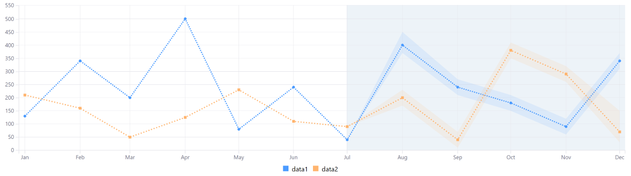
view.jsp. Add aMixedDataColumnobject—a column that supports both single number values and arrays of three numbers—for each data series. Single number values define existing data. Arrays of numbers are used as the prediction/forecast data and contain three numbers: a minimum value, an estimated value, and a maximum value. The estimated value is rendered solid and surrounded by a highlighted area with borders specified by the minimum and maximum values. This lets you visualize your estimated values, while also giving you an idea of the possible value ranges. Use theaddDataColumn()method to add each data series:<% private PredictiveChartConfig _predictiveChartConfig = new PredictiveChartConfig(); MixedDataColumn mixedDataColumn1 = new MixedDataColumn( "data1", 130, 340, 200, 500, 80, 240, 40, new Number[] {370, 400, 450}, new Number[] {210, 240, 270}, new Number[] {150, 180, 210}, new Number[] {60, 90, 120}, new Number[] {310, 340, 370}); _predictiveChartConfig.addDataColumn(mixedDataColumn1); MixedDataColumn mixedDataColumn2 = new MixedDataColumn( "data2", 210, 160, 50, 125, 230, 110, 90, Arrays.asList(170, 200, 230), Arrays.asList(10, 40, 70), Arrays.asList(350, 380, 410), Arrays.asList(260, 290, 320), Arrays.asList(30, 70, 150)); _predictiveChartConfig.addDataColumn(mixedDataColumn2); _predictiveChartConfig.setAxisXTickFormat("%b"); _predictiveChartConfig.setPredictionDate("2018-07-01"); List<String> timeseries = new ArrayList<>(); timeseries.add("2018-01-01"); timeseries.add("2018-02-01"); timeseries.add("2018-03-01"); timeseries.add("2018-04-01"); timeseries.add("2018-05-01"); timeseries.add("2018-06-01"); timeseries.add("2018-07-01"); timeseries.add("2018-08-01"); timeseries.add("2018-09-01"); timeseries.add("2018-10-01"); timeseries.add("2018-11-01"); timeseries.add("2018-12-01"); _predictiveChartConfig.setTimeseries(timeseries); %>Predictive charts have these properties:
axisXTickFormat: An optional string which specfies the time formatting on the X axis. For more information on which formats can be specified please refer to d3’s time format README. This value is set using the
setAxisXTickFormat()method.Prediction Date: A date as a string that represents the point in the timeline from when the forecast/prediction is shown. This value is parsed as a Date object in JavaScript and set using the
setPredictionDate()method.Time Series: A timeline for the data which is displayed on the X axis of the chart. This value is set as an array of dates (
2018-01-01for example). -
Add the
<chart>taglib to theview.jsp, passing the_predictiveChartConfigas theconfigattribute’s value:<chart:predictive config="<%= _predictiveChartConfig %>" />
The area contained within the light-blue rectangle is the point from which the predicted/forecasted values are shown:
Awesome! Now you know how to create predictive charts for your apps.